
Engagement. It’s a key metric of social media. Likes, shares, comments, reach and a feeling of community. Social media platforms need to enhance these metrics to increasingly justify business ROI in social media content efforts. To make a platform more enticing to engage, considered UX is critical from a product design standpoint.
What’s the UX for engagement of the major social media platforms?
Social media platforms Facebook, Twitter, Google (I’m including YouTube due to its scale and the slow-dying Google+ for its UX approach) and LinkedIn all have varied media capabilities. Some having much richer experiences, such as 4K 3D video on Facebook to optimised media streaming delivery for varied bandwidth, to simple image popups.
Regardless of the specific capabilities, the goal of sharing content is to drive engagement, start a conversation while helping get your message out. And that ideally leads to sales, leads, conversions, enhanced reputation and so on.
I’m not focusing on the specific technical media capabilities, only the UX of driving engagements of conversation. For this little critique, I’m reviewing screens at 1440 x 900px – a screen of a mid-tier laptop.
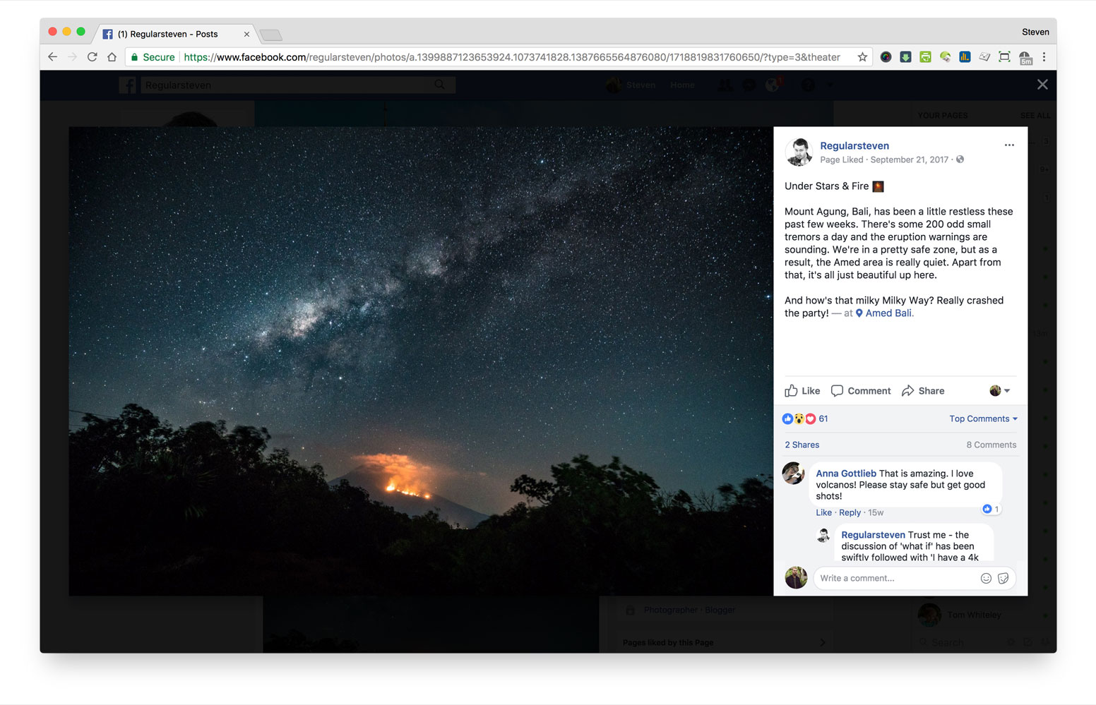
Starting off with the clear leader, in my view, is Facebook. When it comes to presenting a piece of content – photograph or video, you get the true maximised experience of media AND the enticing design to drive a comment – right there and then. Simple, gold standard.
Some key points:
- The UI responds to screen size and makes the best use of the screen
- Shows engagement while you are experiencing the media, allowing you to easily engage in existing conversations
- If part of a slide-show, the UI allows for simple left/right navigation to discover more content
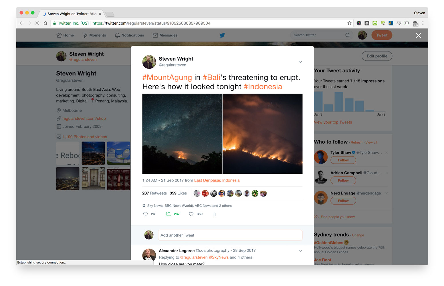
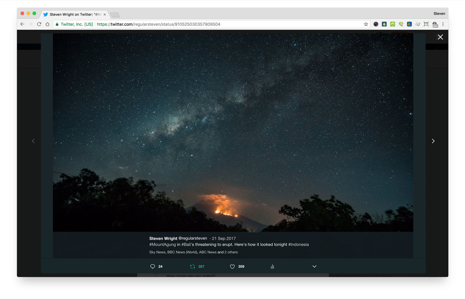
For a social media company that was once a pioneer, they really don’t do themselves any justice on the engagement front. To their claim they are a ‘media company’, they are much less a social media engagement company, it seems. Sure, they might be broadcasting live video, but for simple tasks like viewing a photograph, the wasted space for engagement is a world apart from Facebook.
Some key points:
- The left and right of a tweet with the image(s) is unused dead-space
- The mobile-first mentality to design doesn’t scale up in their UX
- The full-screen view of a photo makes use of screens space, but totally kills opportunity for conversational engagement – a user must click back to comment, and that requires a user to scroll down
Google: YouTube
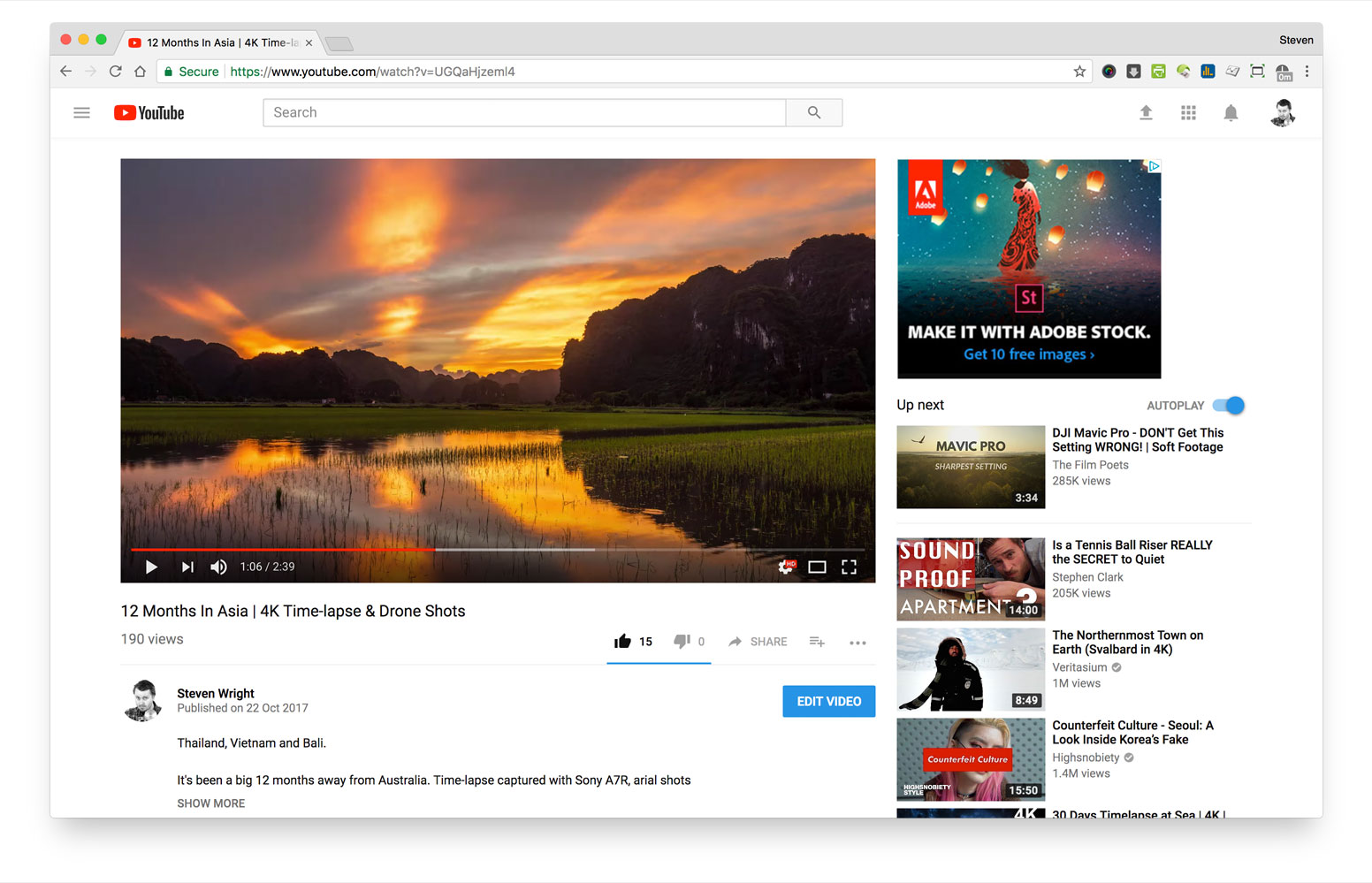
YouTube’s layout for video has been remarkable in its consistency over a long time. The video is the hero, the conversation is third priority, behind the “Up next” section, in terms of screen positions. To me, this is somewhat surprising, considering the strong call-to-action from vloggers who strive for a ‘comment’, ‘like’ or all-important ‘subscribe’. That said, YouTube has also had its’s problems with comments – much of it unquestionable junk and trolling. And one could make the argument that YouTube isn’t really a true social media platform.
That said, it’s worth a look in terms of experience design for community (social) engagement.
Some key points:
- The media player scales to make reasonable use of the screen, but the user must scroll to see comments
- Priority seems to be the ‘Up next’ section, more than encouraging conversation
- If a user wants to see the comments, unlike Facebook, there’s no way to see this without losing the video player
- Given their issues with spam comments, it’s not that unsurprising that focus hasn’t revolved around conversation
Google: Google+
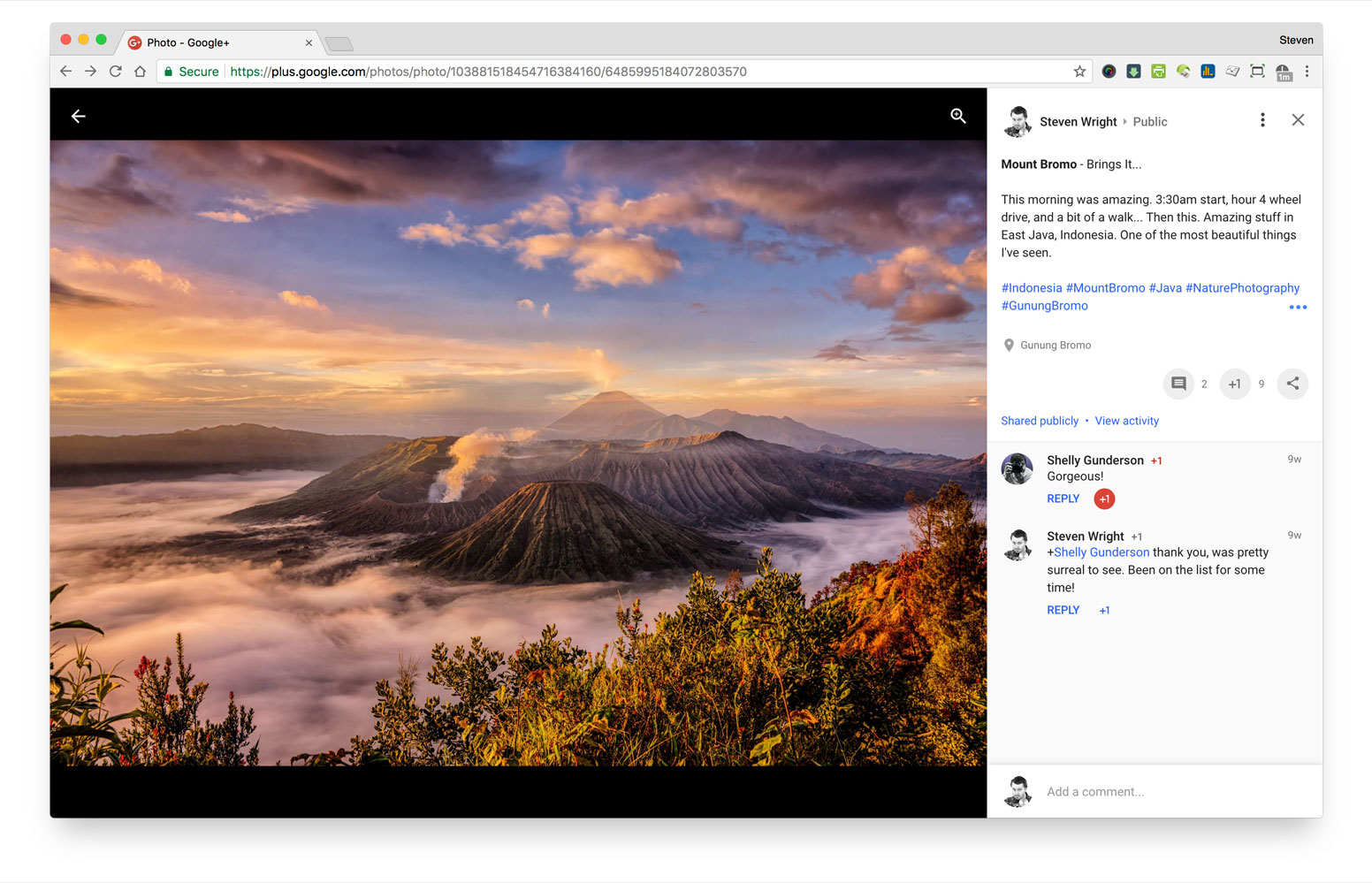
Despite the obvious failings of Google+ and it’s turbulent, declining life, it’s got a reasonable design that gives many nods to the Facebook design. The big difference is that the description fields and comments take the full-height of the screen, not just the height of the photograph. To me, this is a step ahead of Facebook, but that seems to count for little in the sense of overall adoption of the platform.
Some key points:
- If it weren’t for Facebook’s overall dominance, I’d say this is the best solution for viewing media and encouraging conversation
- The black space atop the picture allows for a ever-present Zoom icon – Facebook only present this on hover
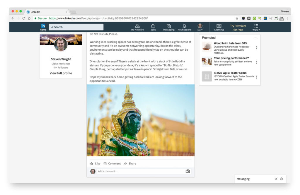
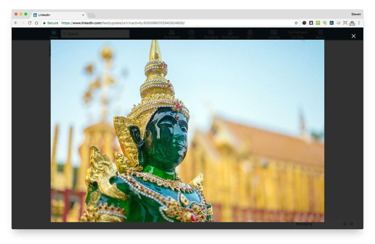
LinkedIn seem to invest the least in managing media that is designed to drive engagement. This could be by design, as they would prefer content publishers to produce longer-form content with a more traditional article structure, or out-bound linking nature. But, of one of the most basic, established functions of a social platform, the ability to view and engage with an image using the screen-space available is quite surprising. Viewing an image, one needs to scroll below. But clicking on it? You have no options, except ‘close’.
Some key points:
- No focus on engagement exists if you’re interested enough in the media to click on it
- Presentation of the image makes maximum use of the screen
- Engagement on visual media (video is the same) doesn’t seem to be a metric that matters, from the current UX
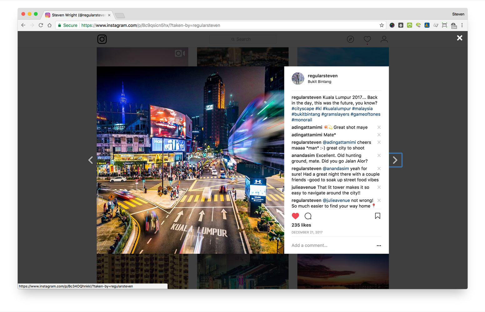
Considering that Instagram is a mobile first company, they have an okay desktop experience with regards to encouraging engagement. Their historical roots in square images mean that images straddle that middle ground of being able to use the screen on both desktop and mobile. That said, their’s opportunity for better comment engagement – or at least management – on the desktop view. Overall, it’s pretty good and does more than I think they need to.
Some key points:
- When in full-screen, the with matches the view of the previous columns – this could be optimised
- There’s easy capability to jump between images and scan comments
- Unlike the mobile app, there’s no ability to nest comments as replies
Social Media Platform UX wrap-up
In general, it’s pretty widely agree that Facebook (and Instagram) are smashing it, LinkedIn is increasingly important, Twitter is in steady (to some, no growth = decline), YouTube is solid and Google+ is on life support. Feel free to disagree to that, but this seems to be a common consensus.
With that in mind, it’s hardly surprising that Facebook are just dominating on media engagement, and this little series of observations is one demonstration of where, why and how. On the flip side, it’s astounding that Twitter hasn’t stepped up their media game. Honestly, these solutions are hardly rocket science, but MUST go a long way to contribute to a user taking a step to share their thoughts and engage. Making actions harder than they need to only hurt engagement, and in a competitive landscape where ‘Twitter is dying’, it’s pretty surprising.
As for the other players, LinkedIn don’t seem to make media engagement a priority but prioritizes efforts in other places (such as influencer/talent identification & blogging). To me, it’s not really good enough. YouTube only-just get’s a pass because it’s got enough headaches with comments, and I kinda just feel sorry for Google+ who’s on death row.
I wonder if Twitter will introduce some simple changes to encourage engagement. I don’t see it as a being a big job, in all honesty. They’ve only got market share to lose. And LinkedIn, too…
Final thought?
As for me, know that as-much-as I’m a developer who likes building websites and solutions, I care and think about the experience of all moving pieces. That is the back-end design to front-end user interface. So, if you’re looking for someone to help solve a problem that you or your business has, feel free to get in touch.